A step by step guide on using an Optimal GeoSpace Report in Tableau
Table of Contents

Common Uses for an Optimal GeoSpace Report
The Optimal GeoSpace (OGS) report is a powerful tool that can tell you what the trade area for your study location looks like. This trade area is made up of a combination of a visitors Path to Purchase, Common Evening Location, and/or Common Daytime location, providing an accurate representation of the draw power a location has. This guide will walk you through using Tableau to provide powerful insights with this data.
Visualizing OGS Polygon in Tableau
To begin, unzip your report output file that you received from Data Explorer. The unzipped folder will contain several files:
- OGS-Basis geoJSON file: Spatial file containing study polygon shapes used for analysis
- OGS-Full geoJSON file: Spatial file containing the "raw" trade area polygon with rough edges
- OGS-Simplified geoJSON file: Spatial file containing a smoothed out trade area polygon, ideal for visualizations
- OGS kmz file containing the shapes above
- OGS-Stats and OGS-Summary files: These files provide information such as the size of the trade area and how many devices were used to create the trade area model
For this tutorial, we will use the Basis and Simplified shapes which are best suited for visualizing in a dashboard.
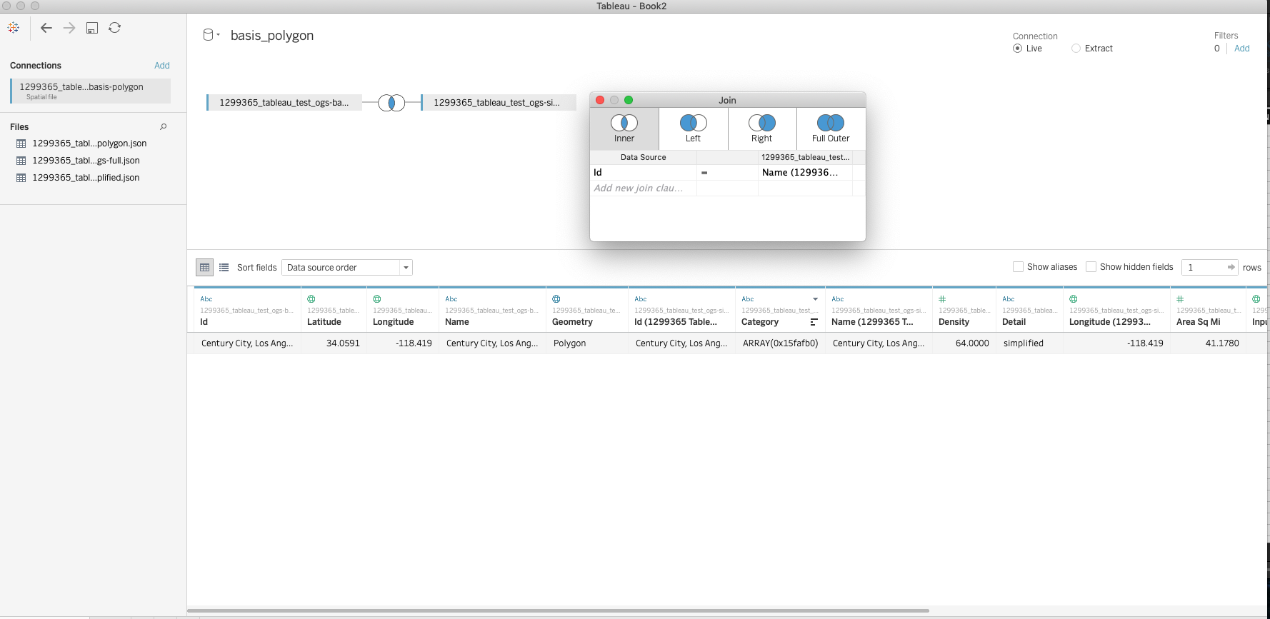
Once the files have been identified, import the Basis geojson as a Spatial File into tableau. Once this is connected, find the simplified geojson in the Connections window on the left and drag the file into the canvas area to create an inner join between the two files. Be sure to join the files in this manner:
Id = Name
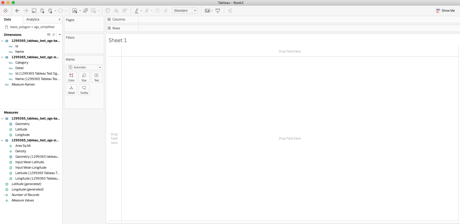
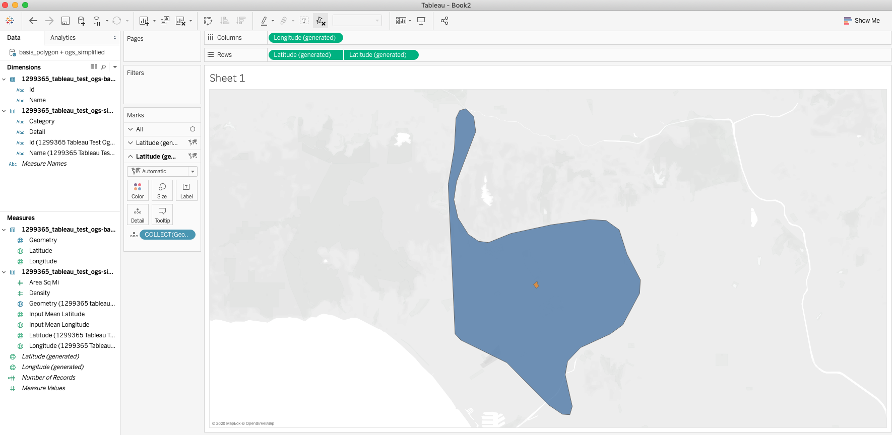
Once this is done, create a new worksheet using the datasource and your window should look like the image below.
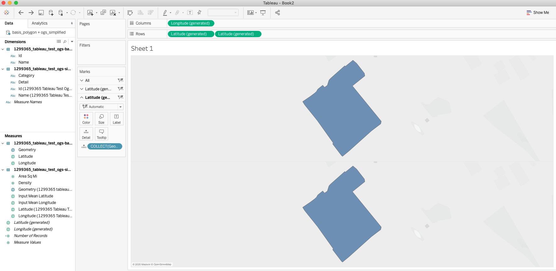
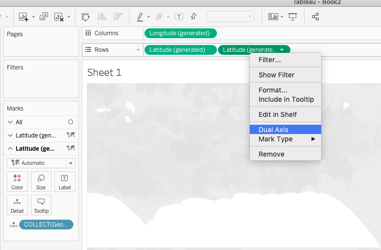
 Double click the Geometry measure from the basis polygon, which will bring it onto the worksheet canvas. This will populate the workbook with the study location. From here, ctrl-click (or Command+click on Mac) on the Latitude (generated) pill in the Rows window and drag it to the right to add another Latitude (generated) pill. This will duplicate the shape like the image below.
This will add a duplicate card in the Marks shelf on the left hand side. Delete the Geometry Detail in the middle card and replace it with the Geometry Measure from the Simplified geojson as a Detail. This will change the shape in the second half of the worksheet to the Simplified polygon.
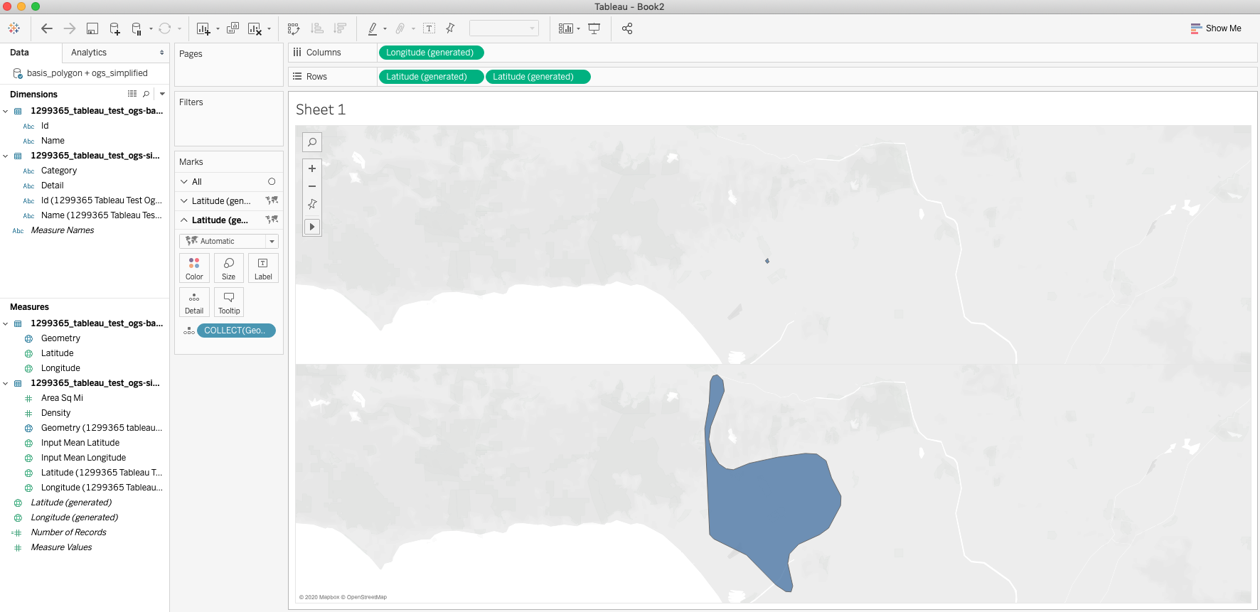
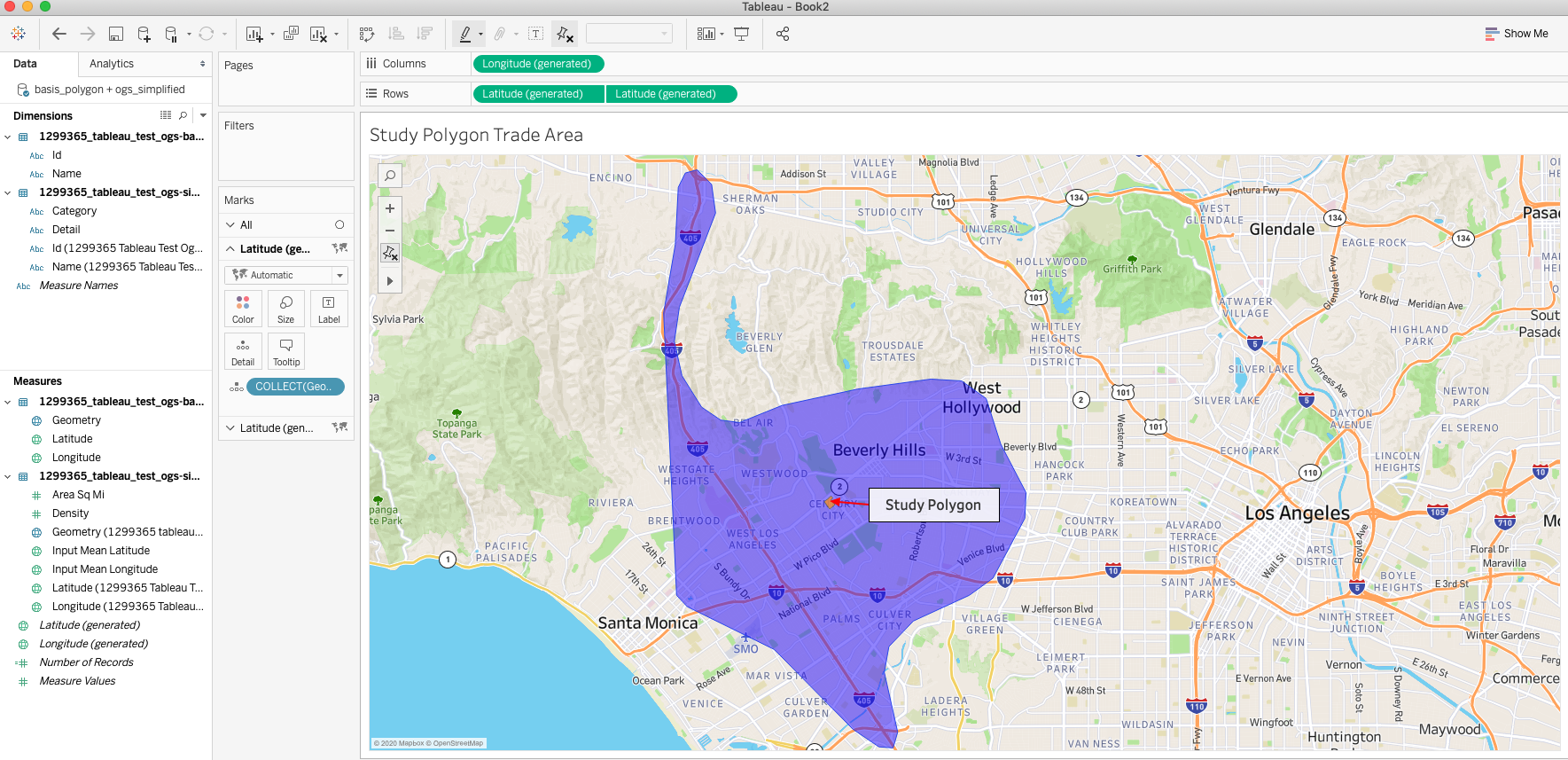
Then right click the second Latitude pill in the Rows shelf and select the Dual Axis Option. This will combine the two shapes into one image. Change the colors in one of the layers so that the shapes can be identified.
After you have completed these steps, then you can go ahead and customize your visualizations to change base maps, colors or add filters. Doing so will enhance the visualization and help stakeholders get the most out of your visualizations.
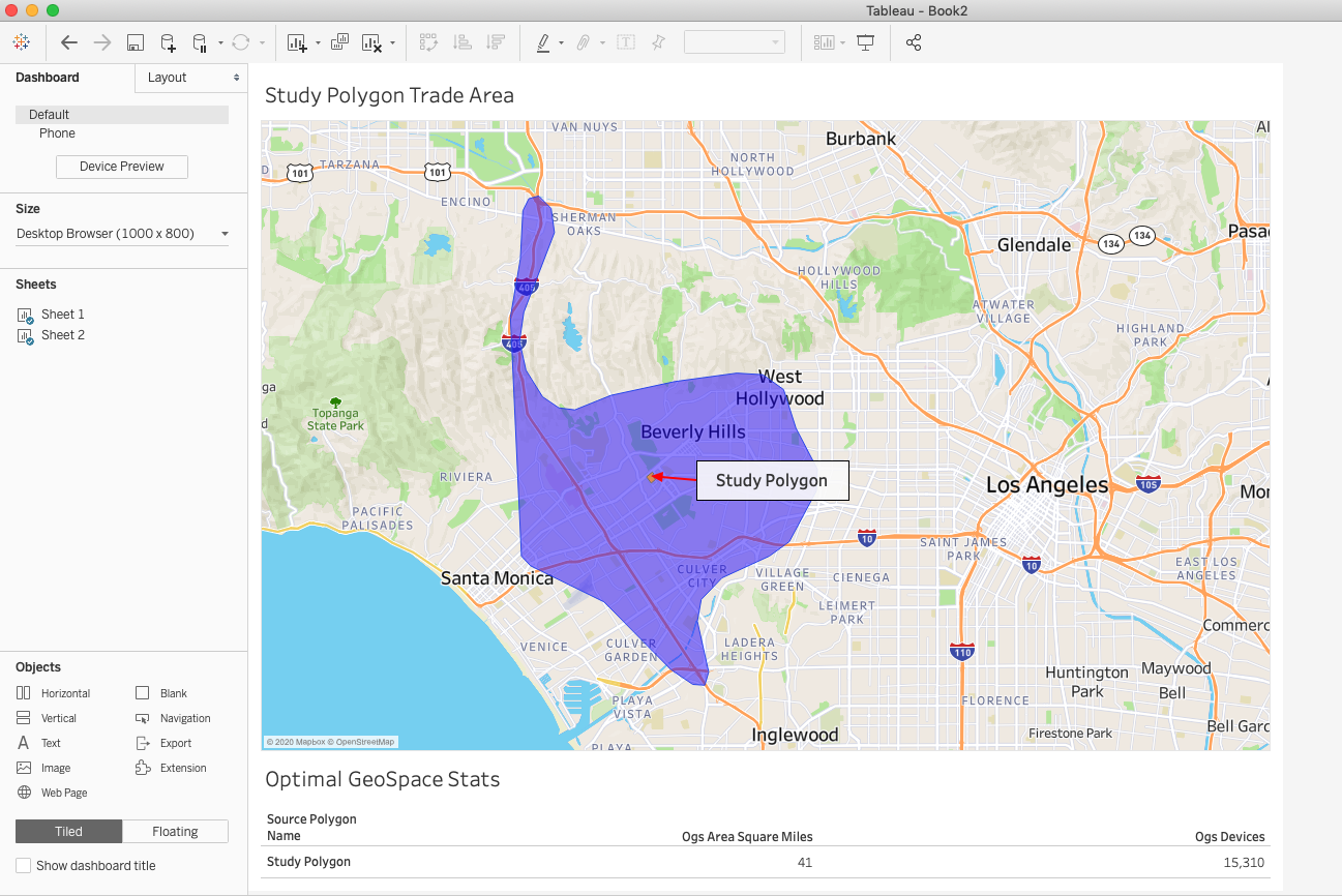
You can even combine this visualization with the Summary datasheet to provide additional information as a dashboard for all in your organization to see.
Get creative and happy exploring!
For more information on OGS Reports please reference this page: Optimal GeoSpace Report
Insights provided by Near in this study are aggregated and de-identified, not tied to any single device or individual. Near adheres to GDPR and CCPA and has been certified for privacy compliance by Verasafe, an independent third party.
About the Author
Raul is Near's in-house Tableau and ESRI expert with background in microbiology. He is passionate about using science and art to craft stories that excite and inspire, and wants to help you do the same.