A step by step guide on using a Pathing X Report in Tableau
Contents

Common Uses for a Pathing X Report
The Pathing X report is a powerful tool that can tell you about where a visitor to your location goes to before or after visiting. It can also be useful for determining what roads visitors are taking to get to a location. This guide will walk you through a few scenarios where Tableau can be used to give you powerful insights with this data.
Visualizing Path To and From Study Location
Tableau can be used to visualize the paths that visitors take to and from your study location. Be sure to have the spatial file of your study polygon handy for this tutorial.
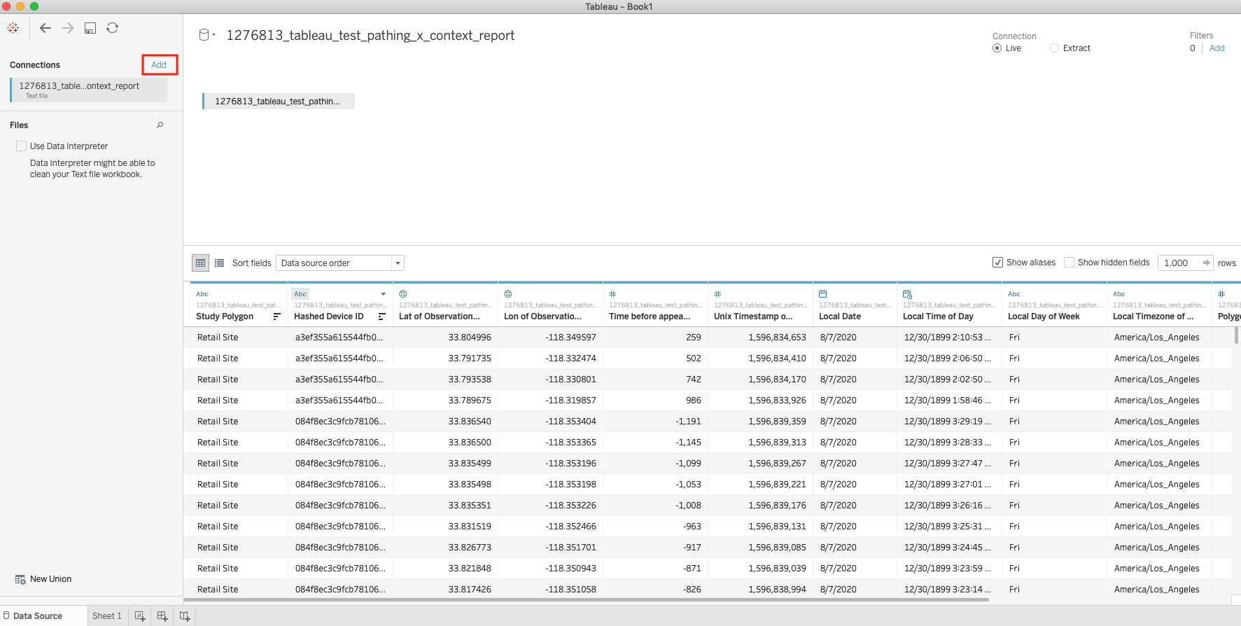
Load both the Pathing X Report as a Text data source, and the spatial file (typically a GeoJSON) into your active Tableau workbook. These two datasets need to be added in as a cross-database join before working with the data. To do that, first load in the Pathing X report as a new datasource. Then select the add option in the top right corner
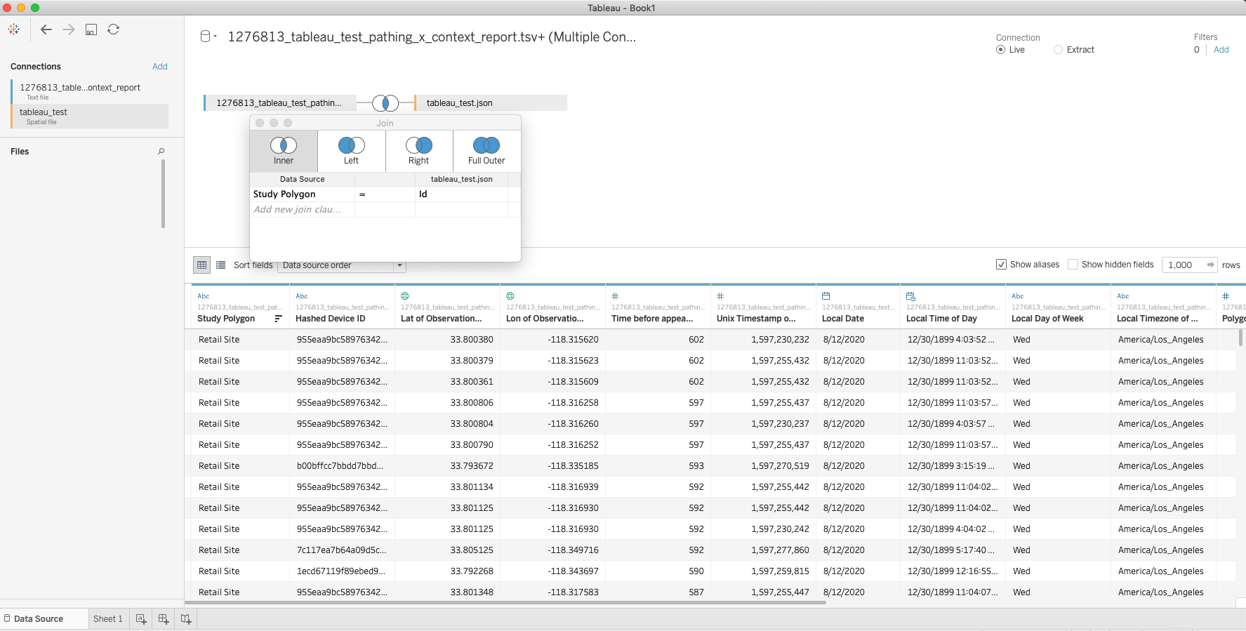
Find and select your spatial file, and then join the datasets on a common key. If the spatial file came from the Polygon Collection Builder tool within Vista, then the join key is simply:
Study Polygon = Id
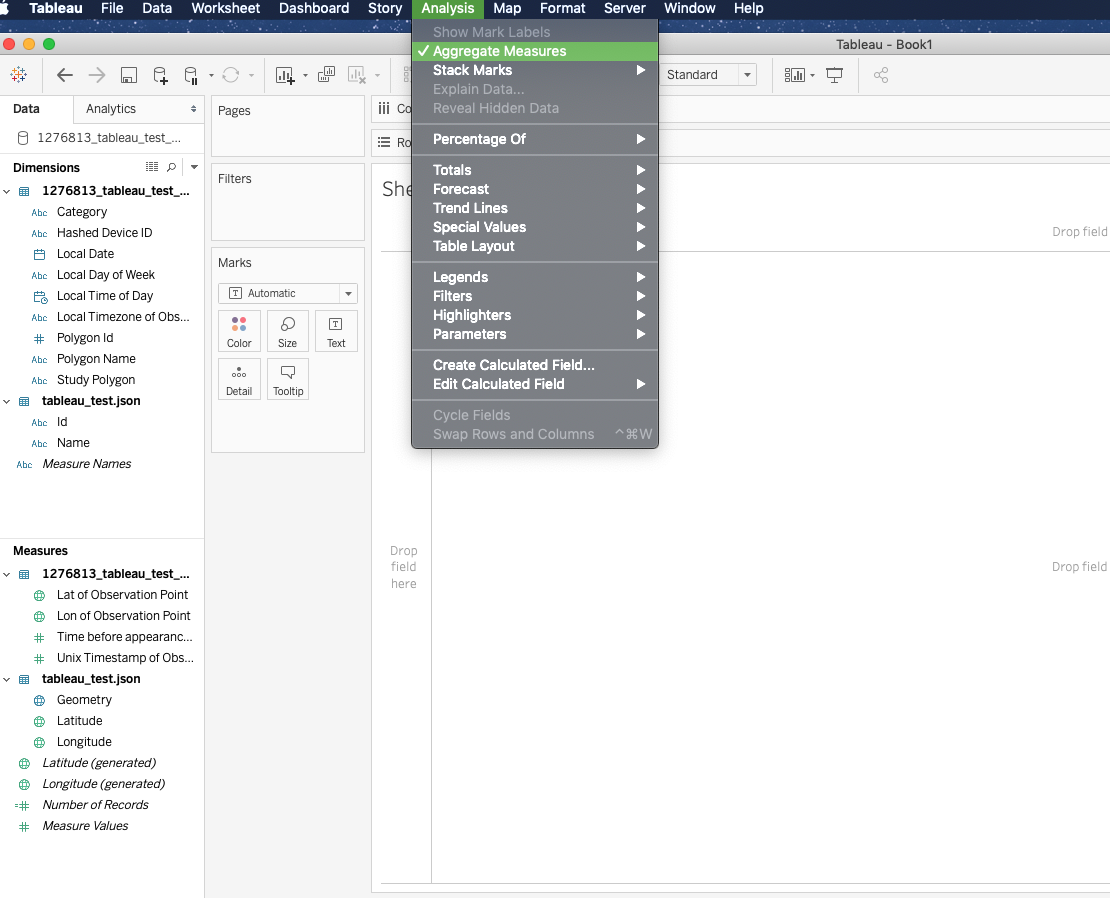
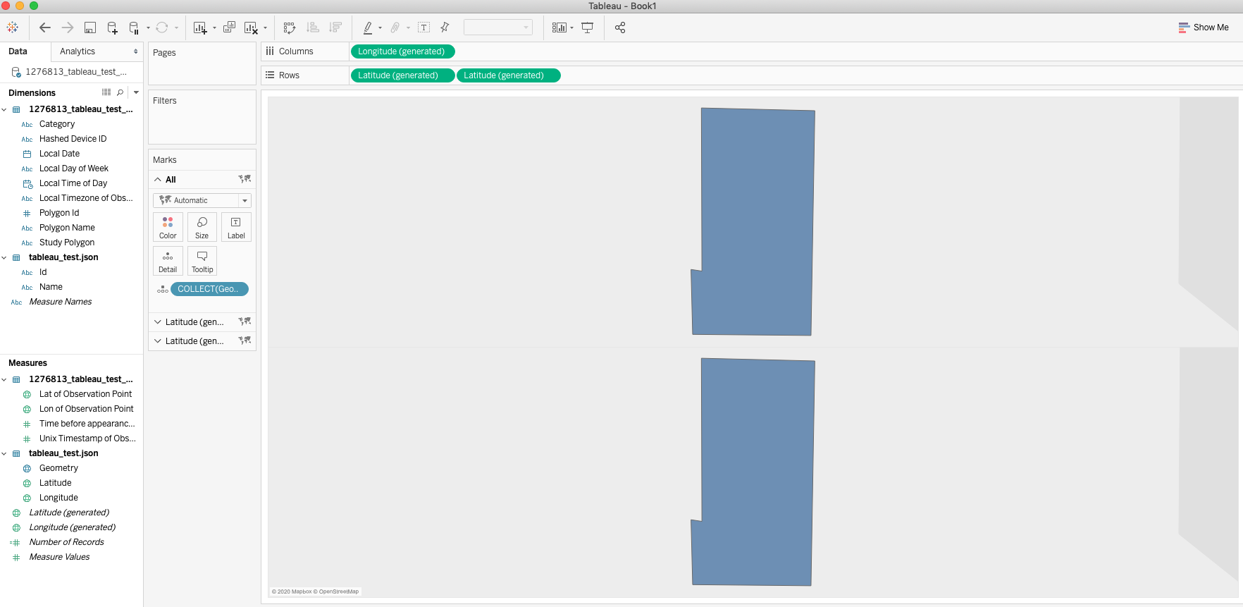
From here, start a new worksheet and be sure to uncheck the Aggregate Measures option by clicking on Analysis in the menu bar and then deselect the Aggregate Measures option.
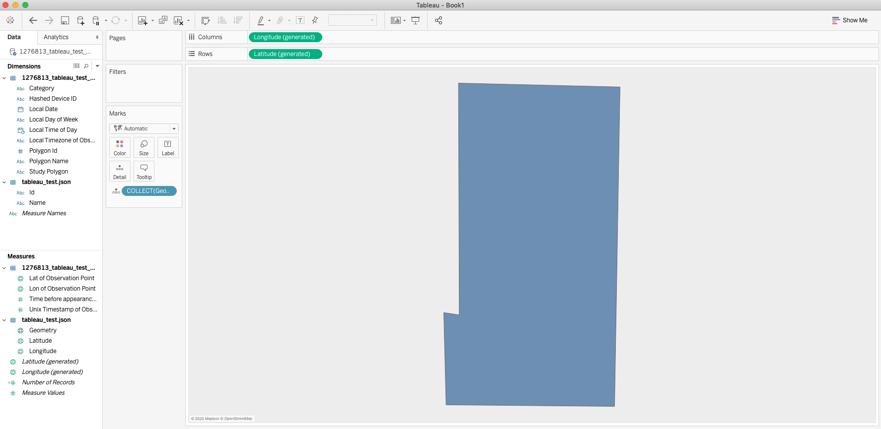
First double click the Geometry measure, which will bring it onto the worksheet canvas. This will populate the workbook with the study location.
From here, ctrl-click (or Command+click on Mac) on the Latitude (generated) pill in the Rows window and drag it to the right to add another Latitude (generated) pill.
Then right click that second pill and select the Dual Axis Option
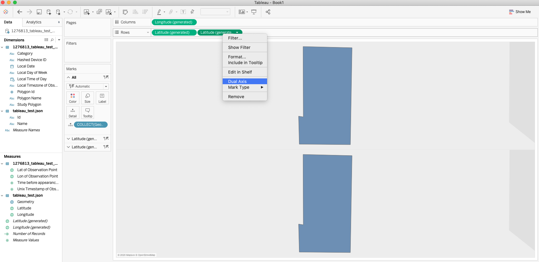
Doing so will add an additional drop down menu on the Marks card. Click on the middle drop down menu and replace the Geometry detail object in the card with the Lat of Observation Point and Lon of Observation Point measures.
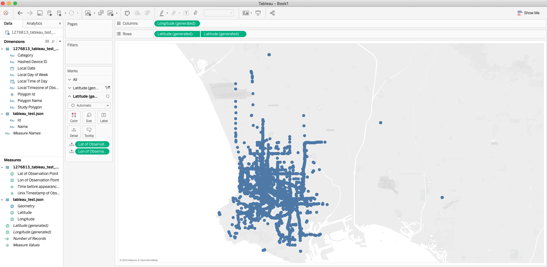
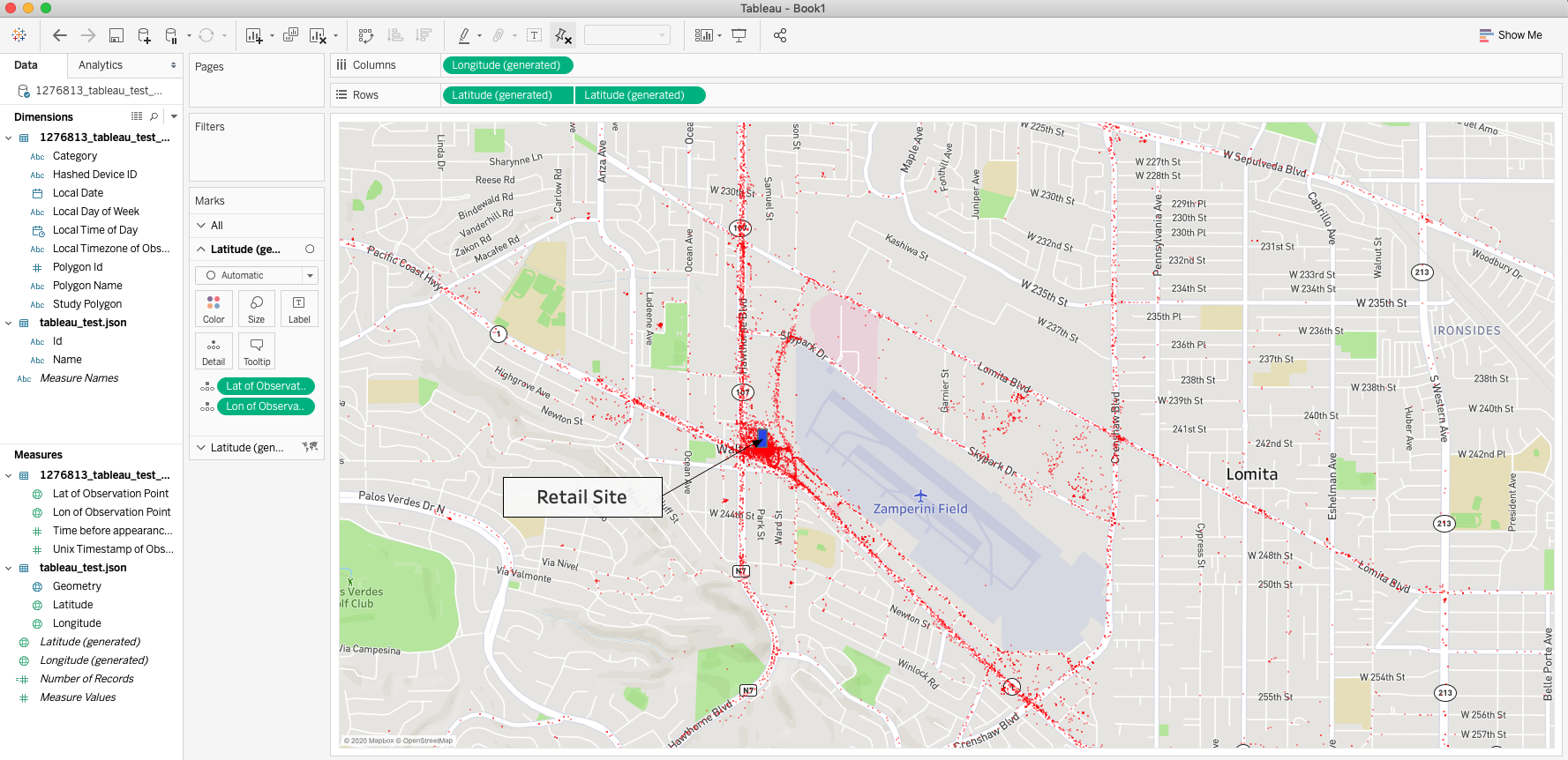
The visualization should be covered in points now, which can be adjusted in color, opacity, and size. The visualization can be fully customized from this point, with changes to the background maps or custom filters to sort your data. This is just one way of using the data in a visually striking manner to gather powerful insights about your study location.
Using Pathing X to Understand Visitation Trends
The Pathing X report can also be used to understand where visitors travel to before or after visiting your study location.
In order to follow along with this part of the tutorial, your Pathing X Report must be a Pathing X Report with Context. This dataset contains additional columns that contextualize any Pathing X Report lat-lon points which fall into any of the polygons contained in the Near Polygon Library.
To start, load in your Pathing X Report into Tableau as a Text data source. You should be brought to the Data Source page.
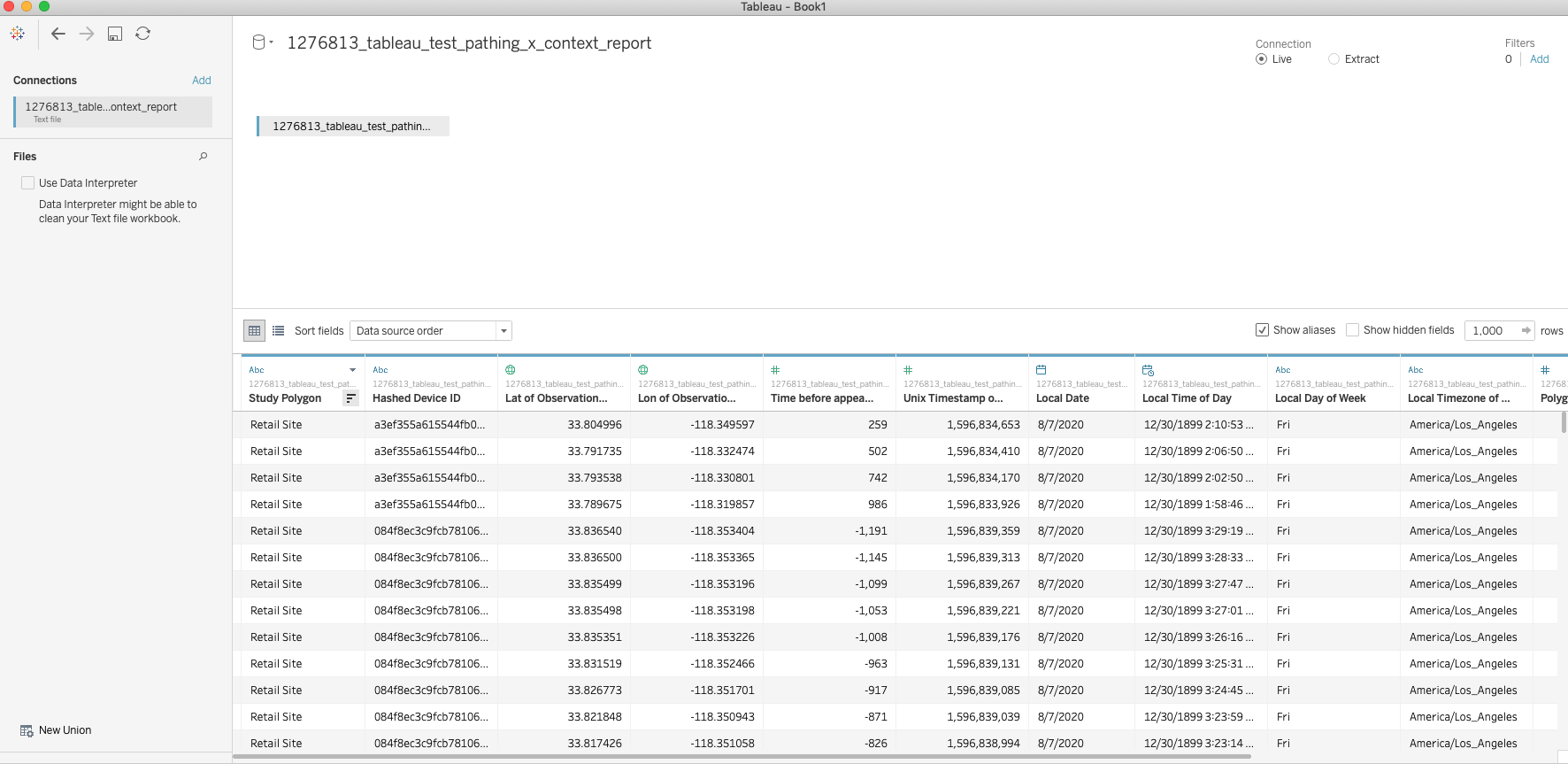
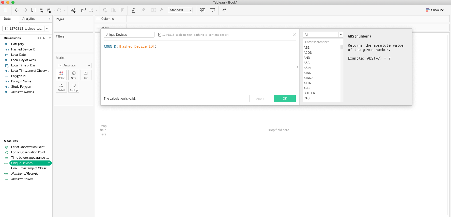
Make note of the data schema, we're mostly interested in the Polygon Name and Time Before Appearance columns. These will help determine where a visitor went to before or after visiting the study location. Create a new worksheet and begin by creating a new Calculated Field from the Hashed Device ID Dimension to get the number of Unique Devices.
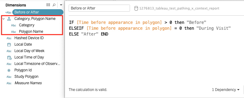
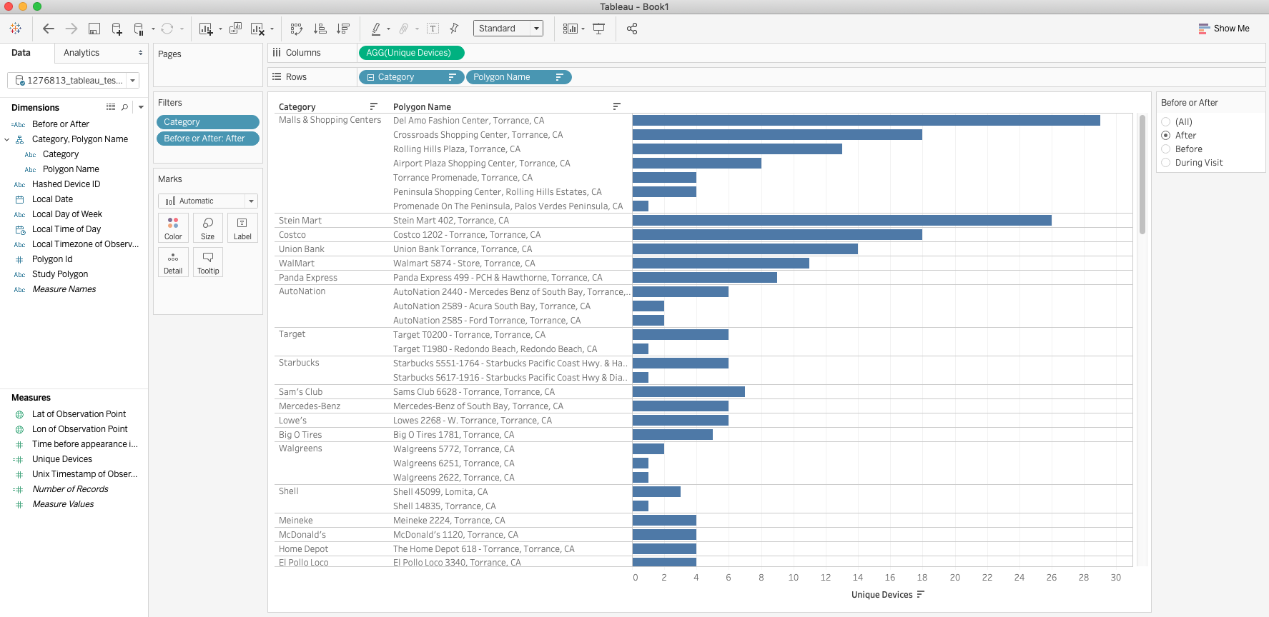
Once this is done, lets also create a Hierarchy by dragging Polygon Name in the Dimensions shelf on top of Category. Finally we will create another Calculated Field named Before or After using the Time before appearance in polygon Measure. These will allow us to filter and visualize our data down the road.
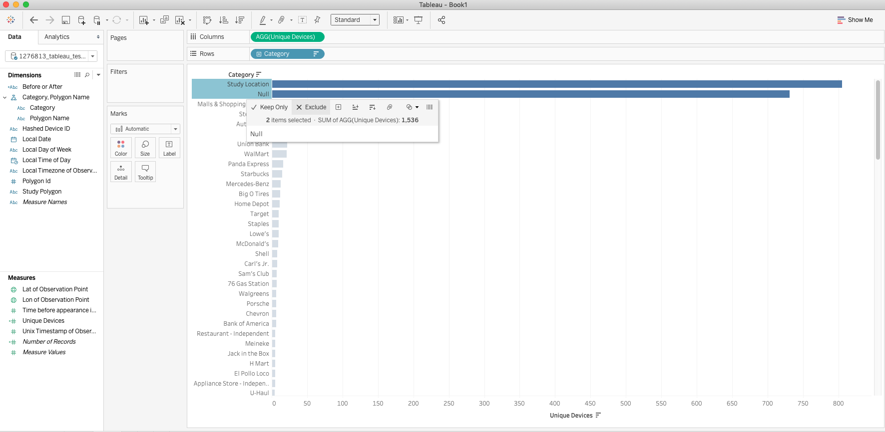
Now that some of the groundwork has been done, lets begin by adding Unique Devices to the Columns shelf and Category to the Rows shelf.
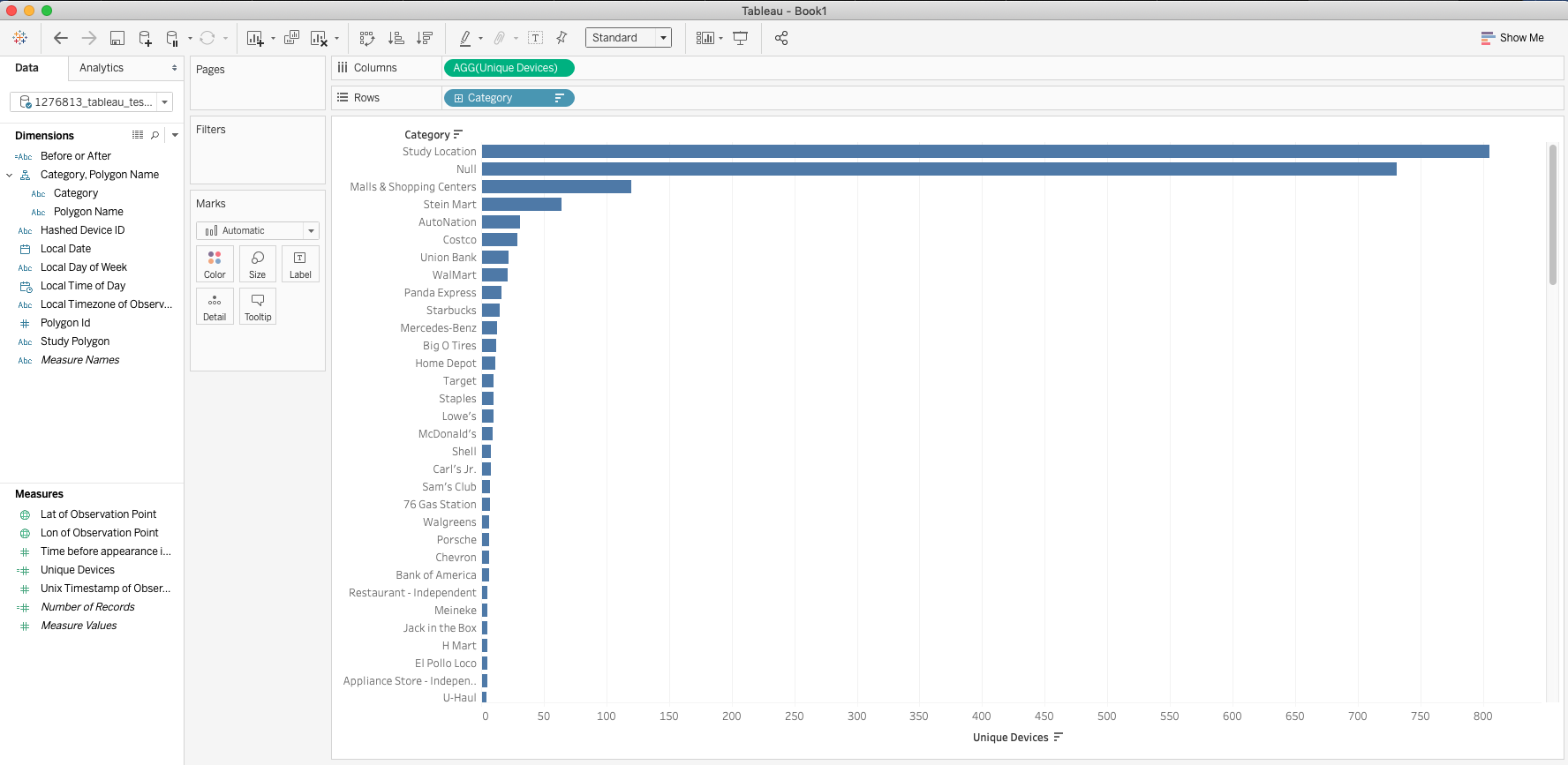
You will notice that the two top categories are your study location and Null. The null values exist because the Pathing X report is not able to contextualize points that are not located within an UM polygon. The points that are located within the study polygon have a Time before appearance in polygon of 0, meaning that they are in there during their visit. This information doesn't really answer the question of where people are visiting before or after their visit so we will go ahead and filter those values out by selecting them on the visualization and selecting Exclude on the tool tip window.
Once this is done, then we can also add the Before or After dimension as a filter that we can use to determine whether people visit the location before or after visiting the study polygon. From here you can drill down further into your data, customize colors, or even add more filters to get the insights that you need from your data. Get creative and happy exploring!
For more information on Pathing X Reports please reference this page: Pathing Reports
Insights provided by Near in this study are aggregated and de-identified, not tied to any single device or individual. Near adheres to GDPR and CCPA and has been certified for privacy compliance by Verasafe, an independent third party.
About the Author
Raul is Near's in-house Tableau and ESRI expert with background in microbiology. He is passionate about using science and art to craft stories that excite and inspire, and wants to help you do the same.